Home • Blog • How to choose what to optimize: 7 ideas for a/b testing
How to choose what to optimize: 7 ideas for a/b testing
There is only so much you can design and implement for your website to increase conversion rates. However, no blanket change will lead to more sales. To know for sure, you should test. Every CTA, design, and text on a website should not be done on the off chance.
But you should start somewhere. We’ve compiled a list of the most important elements you should test, along with why and how.
Before we get started, you can check out our previous posts on A/B testing:
- CRO from scratch. Part 2.
- CRO: why, when and how to optimize the conversion rate in e-commerce?
- Conversion intelligence: AI for CRO
- Multi-armed bandit vs A/B test: choose your fighter
We have audited quite a few sites. We talked to clients, and the fear of the unknown exists. And the website design mistakes are similar.
If you want to order a CRO audit Test pack from us, read this article first.
However, you won’t get redesigned versions of your website and customized recommendations.
To get tailored recommendations + AI eye-tracking insights, order CRO audit: Flexible 10-pack
Now we give you a list of 7 blocks with ideas on how & why to test them.
There is a bonus. Ask Yourself images for each of the blocks you should test & optimize. Hope you find them useful.
Let’s dive in.
Call to action (CTA)
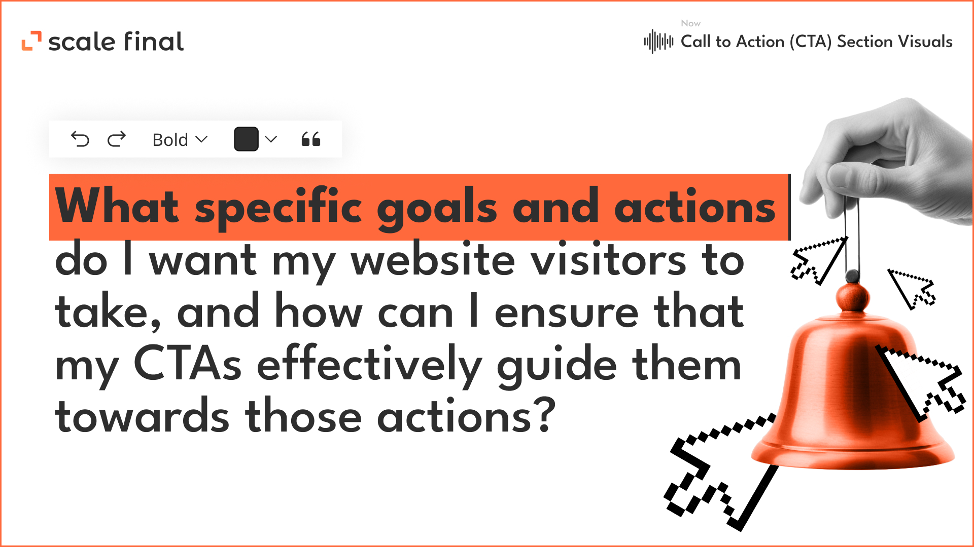
- Try “Buy now” instead of “Add to cart.” This creates a sense of urgency. Your user may not postpone the purchase but make it immediately.
- Use the hover effect to spice up a static design. Test different animations when you hover over the CTA.
- Place the button in different places on the page. Compare which place generates more clicks.
- Add navigation tips to your CTA. These can be arrows pointing to the button or arrows with explanatory text.
Visuals

- Test automatic video playback and playback on click. Analyze how this affects conversion and average dwell time.
- Work on the visualization of text on the site. Play with fonts and improve their contrast.
- Try different voiceovers for videos on the site. Does a video with a male or female voice get more views?
- Replace the usual image with a slider that lets you see the product from all sides. Or add an interactive 360° image.
- A picture of a customer with a product or a product image? Users may respond better to the emotions of a real person than to a product image.
Copy
- Work on the length of the text. Find out if your site visitors prefer shortened versions of headlines, tags, and product descriptions or if they respond better to more detailed information.
- Try out different headlines. Use simple and abstract, vacuous and creative.
- Experiment with the style of the text. Does emotion contribute to better perception? Add jokes, references, and emojis.
- Add a FAQ section. Answers to questions help dispel users’ doubts and influence the number of transitions to the next stage of the sales funnel.
Content
- Paid or subscription-based. Find out if users want to register to access materials on the site.
- Work with the tone of your content. Different tones and styles of text influence user behaviour on the site.
- Check how the content is displayed. Do users prefer to scroll the page or go to the next page after clicking?
Navigation
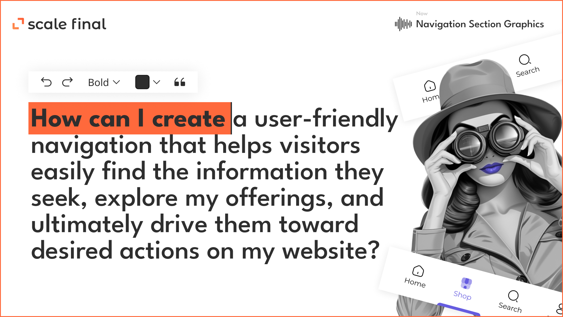
- Test the order of the navigation menu items. Maybe this block should be moved to the right?
- Check the display of the navigation bar. Do site visitors prefer horizontal or vertical orientation?
- Try renaming the elements. For example, “Why you should work with us” to “How we work”.
- Remove the menu blocks from the website that are rarely used. Removing the unnecessary can increase the number of clicks on CTAs.
Forms

- Test the length of your registration forms. Try removing unnecessary steps or moving them down the funnel.
- Offer a special deal, discounts or promotions for filling out some forms. This will increase the number of signups.
- Mention that you’ll not spam. Reassure users that you won’t trash their emails when they leave their information.
- Add a description to each field. This way, users will take advantage of the areas where they need help understanding something.
- Compare personalized and general approaches. Address the subscriber by name or limit yourself to “Good day!” to check the number of emails opened.
- Determine the best time to reach your target audience. Try different sending days and times.
- Try different “From” subject lines. Do readers prefer a message from the CEO, the marketing manager, or someone else?
- Change the design of your emails depending on the browser and device. Analyze how this affects subscriber behaviour.
Author
-
 ScaleFinal Content Writer
Experienced writer in different domains. I package meaning into words and bring people together. Know how to convey the vision and values of a product in writing. I like reading, movies, sports and blockchain.
View all posts


