Scammerwatch
Backed by a team of experts with backgrounds in cybersecurity and crypto, ScammerWatch provides in-depth analysis of cryptocurrencies to help users make informed investment decisions.
So whether you’re a seasoned crypto trader or just getting started, ScammerWatch is your go-to resource for everything crypto. Join the thousands of satisfied users who have turned to ScammerWatch in order to protect their investments and learn more about crypto trading software.
Target audience: Crypto Traders, 20-40, UK, US, Europe

ScammerWatch PressKit

Niche Conversion Analysis
Main conversion goal is to transfer generated traffic to 4 legit trading bots’ websites
| Average | Сlient’s Request | ScammerWatch |
| Affiliated links CTR | 0,5% | 0,6% | 1,1% |
| Time spent on the website | 30 sec | 55 sec | 1.35 min |
| Scroll depth | 25% | 40% | 49% |
Numbers
Readers
Readers per month
Email subscribers
Client's request

- Create a website
- Build a brand identity
- Content planning
- Friendly UX/ UI design
- Site visibility and high traffic
- Convert readers to partner clients through affiliate links
Challenge
The market for trading software is huge, and new scam projects are popping up daily. Since trading bots are not regulated, it is hard to understand what is a good tool and what is not. Many malicious actors buy ads and reviews even on trusted review platforms, and create multiple projects and fake identities, so it’s hard to keep track of them. The biggest challenge in these circumstances is to deliver a transparent product that is profitable, useful, and trustworthy.
Legit Cases Bar
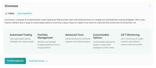
The 4 best-verified trading bots are placed in blocks, with a button to read the full review so as to answer the first user question that arises: “I want to start trading. Which software should I use?” By introducing such a block, we increased the time spent on the site by 35%. Although the action button ‘Try this bot’ made users leave the site and try the instrument right away, costing us some of the time-spent rate, we made it nevertheless for users’ convenience.
We’ve added important categories such as Rating and Key Highlights to provide straightforward information.
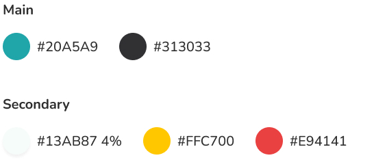
Color for legit trading software: green
Signals to users that the application is safe
Our Advice Bar
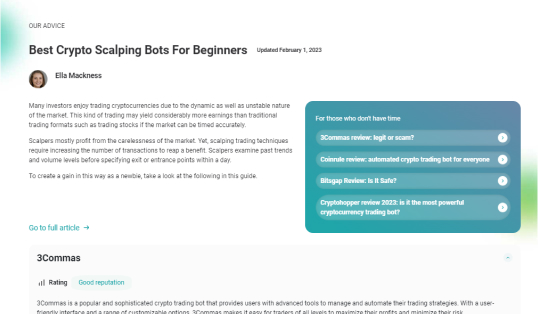
Tired of falling victim to cryptocurrency scams and losing your hard-earned money? Scammerwatch will take care of your time and money. So, we placed the most vicious scam trading bots on the main page in short explanatory blocks, with the possibility to read the full article by clicking on the clear ‘Read the Full Review’ CTA button.
Color for scam trading software: red. Signals to the user that it is not safe.
To increase the conversion rate, we placed related scam bot links via the banner “For those who don’t have the time.” By placing this banner, we made the bond between the site and its users stronger: Scammerwatch knows how long and hard it can be to find any truthful info on the net regarding scam trading software.
Delivery
Our client has joined the affiliate programs of the top 4 crypto trading bots. The task is to convert Scammerwatch site’s traffic to these 4 trading bot clients. We have listed the top existing trading bots and flagged scam/legit offers. We have also made comparisons between these bots.
We met the challenge by combining UX and UI, dividing the content into categories, adding call-to-action buttons, interlinking the articles, articulating the clear mission of the client, and highlighting the team’s work and educational background.
The main page menu
The main page menu is simple and clear: Crypto trading software reviews, Scam coins and tokens, and Cryptocurrency. To increase users’ action, we created a small dropout menu with links to the most popular articles in each section.
We’ve added recognizable icons in What we provide Bar, a short and catchy explanation for users of what they are getting with the Scammerwatch product. With the help of i-tracking technology, we spotted a place to communicate the client’s intentions clearly.

Block for beginners Bar
We interviewed our clients on the best articles to onboard users. Then we placed those articles on the main page under the clear label “Block for beginners”, so that beginners can know what to expect with Scammerwatch.
The articles are short versions to make users want to learn more. We added a descriptive action button “Read the full article” to make user engagement easy. By correctly choosing the place for this block, we increased scroll depth by 43%.

Recent articles
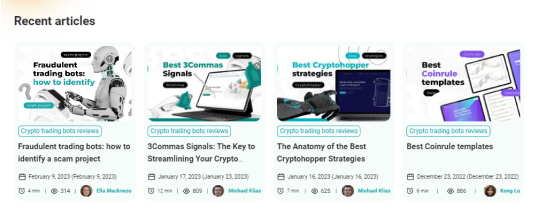
A bar with recent articles provides both a conversion rate increase and drives excitement. Users are now spending less time searching for the hottest topics. To make the product more transparent, we added important metrics such as the number of views, the time of publication, and the time it takes for a user to read the article.
Trust pages

Our authors
Scammerwatch especially asked us to increase the trust level of the site. We delivered by introducing short bios, photos, and social media links of the team. Users can learn more about Scammerwatch by staying on the site.
- Contact us
- About us
- Terms & Conditions
- Privacy Policy
Scammerwatch is compliant with Google E-A-T rules.
Newsletter
A free, easy-to-subscribe-to newsletter was introduced so as to add to the engagement via the CTA button.

Crypto trading bots reviews page
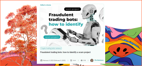
We increased user engagement by putting blocks on top of page 2: the Editor’s Choice article and the Clear Introduction to the page.
Editor’s choice
Flagship article. A clear banner drives excitement and explains the site’s hierarchy. Date, views count, and author bio add to transparency. Introduction – a quick summary of what the user is getting while visiting the page was intended to add to the scroll depth and again, transparency.
Meet our authors
As we said in the Trust pages section, the Experts section is one of the most important indicators of niche sites’ trustworthiness. The placement of the block was selected after conducting a/b testing.


Hot Search Results
The articles dedicated to the most searched trading software bots are placed on CTA buttons. After the test, we concluded that users were usually leaving the page at this particular place on the page. By introducing the buttons, we increased the time spent on site by 25%.
General Design
It was important to convey the transparency and objectivity of the author’s conclusions, but also to adapt them to visual trends.
We used screens of different devices as design elements so as to recreate the user’s viewing model of a particular service.
To represent the visual association with the transparency and accuracy of the review articles, we made glass figures. 3D elements were used to create an attention-grabbing accent.
To help users understand complex concepts, we created infographic elements, lists, and diagrams.
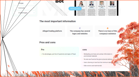
Scam Trading Software Covers Design
We decided to use clear graphic symbols, icons, and colors in the design to warn about dangers.
The design of such articles was supplemented with 3D elements, as well as broken screens with logos and websites of the described software
Cryptocurrency page
We included a summary of what this section is about in order to drive action. By doing so, we increased scroll depth by 20%.
Content: Featured articles with tips, token standards, crypto wallets, and platform reviews;
Delivery: We added clear call-to-action buttons for hot search results to attract users’ attention. After completing niche research on trading software review sites, we concluded that one of the main drivers of trust in reviews is the expert author’s background. Therefore, we highlighted the team’s experience by placing the “About Us” block at the top of the page.
The combination of catchy, informative titles, designed covers, and the number of views adds to users’ engagement and the overall site transparency.

Conclusion
We achieved the goal set by the client: to create a clear and transparent resource for crypto traders of any level, and transfer generated traffic to affiliated top crypto bots. We surpassed the client’s expectations in scroll depth, time spent and affiliated links CTR on the site thanks to proper and clear site hierarchy, research of niche competitors, appropriate CTA buttons, inclusive design, and emphasis on the credibility of our expert authors.


