PingPong Digest<span data-buffer="">
Our client asked for an atypical crypto newsletter – something everyone would enjoy reading.
Since it’s connected to Tradecrypto.com, the target audience: crypto newbies and Gen Z, from the US, UK, and English-speaking European countries.
- Tone of voice: casual, like you are talking to a friend
- Intention: to describe, tell a story/gossip, catch attention via email
- Style: catchy, ironic
- Client’s Task: to launch a 100 000+ ad campaign that will get 0.08% of email subscribers.
- Who are you writing for? Crypto Digest's target audience are crypto newbies, Gen Z, or 16-21-year-olds from the US, UK, and English-speaking Europe.
- Numbers: The newsletter got 1500 loyal subscribers and is ready for monetization through affiliate ads and sponsor blocks
- Use cases: Partnerships, paid ads, guest author content, PR, etc.
- Word count: Every day, we covered 5-7 events in the industry, directly or indirectly related to each reader. 700-800 words per day.
Challenge

One of the most challenging parts is that Gen-Z
avoids using email as a news source. Moreover, the
target audience prefers feed scrolling.
Even though the 16-21 audience is quite familiar
with crypto trading, it doesn’t go too deep into
financial analysis or put too much trust in influencers.
Solution
How do you create an eye-catching newsletter that looks like a feed?
Create GIFs/text scrolling digest with dozens of funny elements inside the email.
Tell a legend about the origin of the project.The Crypto Ping-Pong Digest isn't called that for nothing. Supposedly, the team's editors play ping-pong in the office daily, exchanging gossip from the crypto industry. Readers not only get easy-to-read news, but also an insider's perspective.
Reader’s pain point: They understand the crypto trading market, but avoid boring analyses and deep digging.
The digest’s focus: crypto events affecting daily traders’ behavior, crypto mass adoption, crypto education, legislation, and entertainment.
Therefore, we created daily crypto statistics. Market capitalization, BTC and ETH prices, bitcoin dominance, top losers, and top gainers metrics are published daily.
This information is vital for our audience, which is primarily interested in crypto trading.

Design

We made the design as simple as it’s possible for such a product. Using the parent company’s colors and related fonts, we allow the reader to move between platforms easily.
Since cryptocurrencies are perceived as high-tech and fast-evolving, we also considered that in our design.
Our client specifically emphasized the need for infographics, and F&G is an important example of this.
The F&G Index
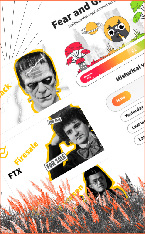
The main design challenge we had to solve was making the infographics simple and readable, but at the same time consistent with the overall mood of the digest and the brand. To this end, we used emoji icons and a gradient scale to represent investors’ emotions. In addition, the UFO plate has become an excellent indicator of market mood movement.
Digest cover
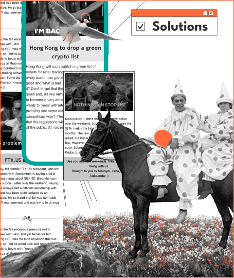
It is created daily and is intended to be fun and captivating. It is not only a cultural reference image, but also entertaining and interesting to save and use. The text of the title is added and completes the cover. Interesting detail: our customers vote daily on 2 options for the cover. So, the cover is interesting not only for the users but also for the team itself.
Design decision
The style is entertaining, conveying the atmosphere of humor and gossip around the crypto world. Using the collage technique, famous personalities from the crypto industry are combined with characters from popular movies, series, and shows to give them new life and finally add to pop culture.
Bring more fun!

GIFs make the text more attractive
Each of the 4-10 texts was accompanied by a GIF – a cultural reference. The memes were special because they all had additional text messages. This made it even more exciting and attention-grabbing.
We added socials on the top and bottom of the Digest newsletter with buttons. This makes it easy for followers to reach out. Tradecrypto’s main site, Crypto Ping Pong Digest, and social networks are interlinked. To increase engagement, we created a rating system for each daily digest so that the followers could provide feedback. Immediately following the catchy title, there is brief summary of the digest news so that readers can easily decide whether they are interested.
Who are the editors?
You can see the faces behind the digest. The digest was not written by a robot, and does not consist of dry facts. To add to the friendly atmosphere, each digest ends with a “Goodbye. See you tomorrow.” farewell. The public knows who wrote the digest.
The approach is the same as at tradecrypto.com. The authors are introduced to the public.
Easy to follow, easy to understand
We have created a “Crypto Digest” button on the main tradecrypto.com page. When the user taps on it, it takes them to the Crypto Digest website, which is also easy to navigate. If a user wants to receive a newsletter via email, they enter the email address in the bar at the top of the main page.
Subscription Bonus
A user will receive a free crypto portfolio template. Just what our target audience needs.
Results:
We gained +1500 active subscribers and generated traffic for the partner site Tradecrypto by placing links with an average click rate of up to 283%. Not only is the newsletter fu n and useful, but the team was also engaged in the process by introducing crowd voting. Read the results of Tradecrypto.com CRO here.


